Daylight News
Daylight X OVO: Strategic agency partnership

Those of you that have been around for a while will know that site builds and development are some of our favorite projects to take on. With the exciting blend of technical proficiency and creativity, the DaBella site was no exception. But what makes this project truly special is the collaboration that took place behind the scenes.
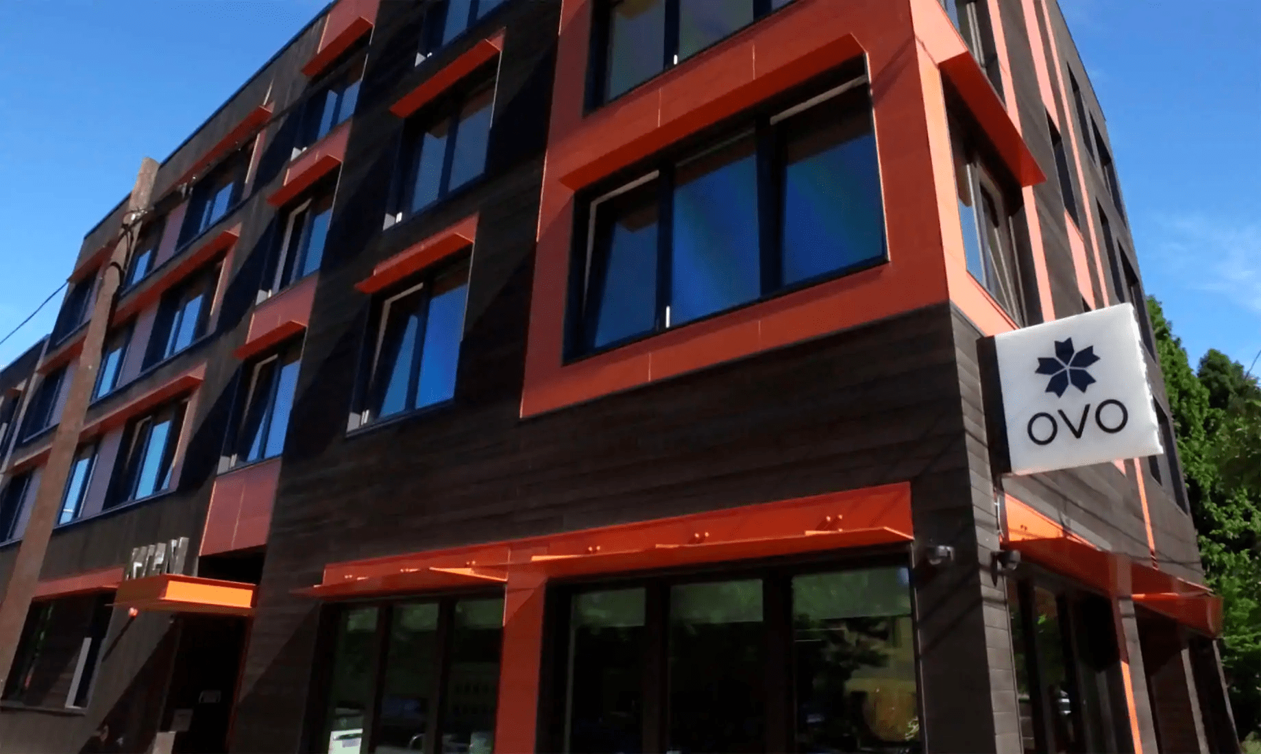
To provide a bit of backstory, OVO, a local branding agency, used to be one of our office neighbors—and Shawn had a connection with one of their Founding Partners. After hearing about our WordPress expertise, they brought us the idea of collaborating and handling the development of the site. DaBella had just gone through a rebrand with OVO, and had started the process of designing an all-new site to align with the new branding. Our job—to make it come to life.
Collaborating with Other Agencies
Once the sitemap was final and design was underway, our interaction with the client would be minimal, communicating with DaBella primarily through OVO’s team. The reality of collaborative relationships between agencies may not be news to any of you; it can be hard to align and forge a pathway to mutual trust and success. But, we believe that unlocking the best ideas are grounded in good listening and embracing creativity in each other and our partners. So, as the designs rolled in from OVO’s creative team, Daylight was able to implement the experience to a beautiful end result.
Agency partnerships are relatively common, though they often aren’t talked about. From our perspective, we feel that we can increase our creative output by having a diversity of people and collaborators in our work ecosystem. It says nothing about what you “can’t do” but says everything about your positive attitude and willingness to do what needs to be done to achieve the desired end result. As it pertains to this particular project, OVO needed a technically creative partner to fill a gap for a website that needed to launch within six months. Naturally, we were happy to help and thrilled at the prospect of building this valuable new agency partnership.
Challenges
The greatest challenge for any project is almost always timeline, which in this case, was about six months. In the early stages, Daylight sat down with OVO to come up with an estimate of how long the development of the site would take based on the sitemap they had put together. The designs themselves were complex and exciting, requiring a more agile approach from Daylight — carving out the core of the site and integrating the designs in phases. The resulting process was mostly fine-tuning and communication, putting it all together piece by piece until the site was complete.
Features
The DaBella site was optimized to be able to handle lots of large images and customize the user’s experience, making it not only beautiful but personable. Some of the features of the site include:
- Customized content through cookies
- Affects the promotions listed in the header
- Determines where the user is coming from and displays content based on the page from which they clicked
- Extensive taxonomy connections for service and location
- Customized contact form to interact with an older CRM
- An alternate design to optimize for mobile
- Testimonials are categorized and pulled into associated pages and can be filtered by source (Google, Home Advisor, Angie’s list, etc.)
- Two different header and footer styles

With a deep dive into our digital properties, internal processes, and customer journeys & lifecycles, Daylight translated our executive vision into a cross-platform user experience.
End Result
Ultimately, the new site is the culmination of our collaboration and a great reflection of the work that each party put into it. While the project presented its own set of challenges, as all projects do, our relationship with OVO has flourished and has led to a continued partnership with them on other projects because of the success of the DaBella site. Along with the success of each of Daylight’s relationships with OVO and DaBella, the website itself was a hit, proudly displaying its responsive design, complex development, and the collaboration that led us there.


