The Springs Living
Redefining senior living with timeless luxury and exceptional care

Overview
Since 1996, The Springs Living has expanded to provide hundreds of seniors throughout Oregon and Montana with vibrant, activity-filled communities. To showcase their distinctive values that all their communities have to offer, the senior housing company called on Daylight for a website rebuild.
A Different Approach Demands More Than an Average Website
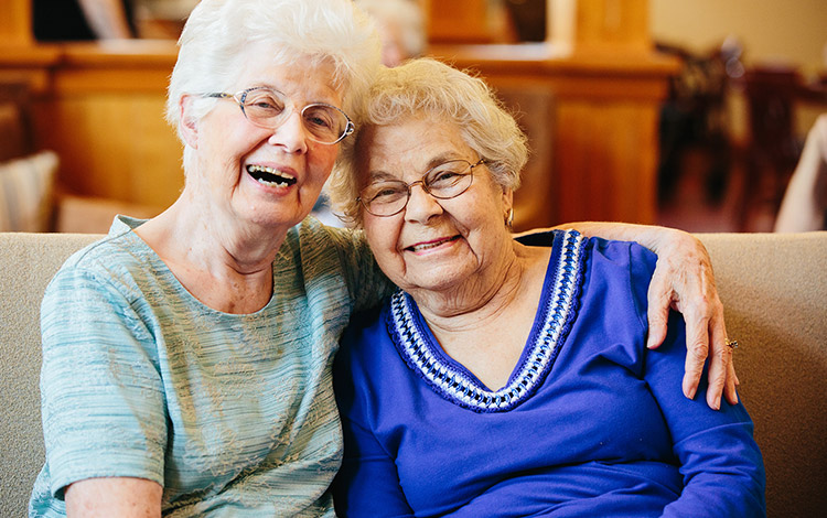
If The Springs Living can be summed up in one word, that word might be “family.” The company not only provides its residents and their relatives with personalized care and attention, but ensures every employee is treated like family. Anyone visiting a Springs Living community would immediately feel at home among the bright, smiling faces… but visitors to thespringsliving.com were greeted by a dated, difficult-to-navigate website that reflected little about what makes the company’s brand of senior living special.
One Brand, 17 Communities
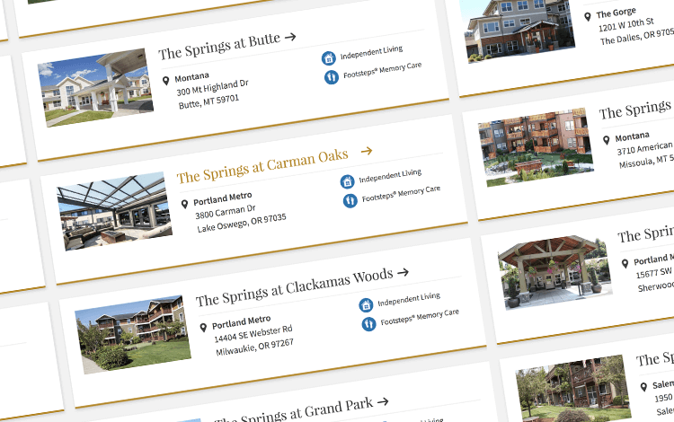
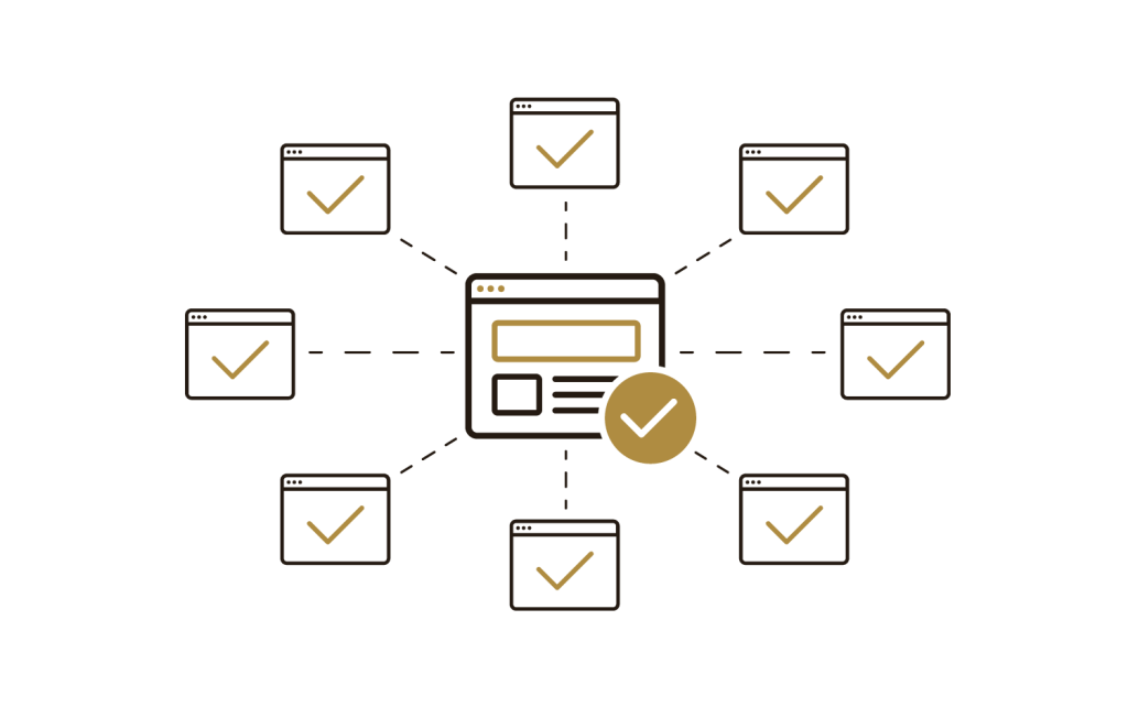
The Springs Living’s expanding regional footprint compounded issues with the company’s online presence and digital marketing strategy. The Springs Living currently operates 17 communities, each with their own microsite. Prior to the rebuild, visitors faced challenges navigating between these communities and the main website. Additionally, it was becoming increasingly difficult—and costly—for the team to keep content up to date across their disconnected digital infrastructure.
Daylight: An All-in-One Partner
Before The Springs Living got in contact with Daylight, the team assumed they would need two different vendors for their SEM and web design needs. Daylight was able to handle both simultaneously. We saw that the marketing team knew what they were doing, but were over-leveraged and needed digital expertise to rebuild their website from the ground up. With Daylight, the team gained access to a full-service partner with robust knowledge of their project.
Rooting the Digital Strategy in Real-World Experience
We toured a number of The Springs Living locations in Oregon, meeting various employees and seeing the ways in which each facility reflected its unique community. Although every location had a character of its own, all shared the same high standards of design and service. Moreover, residents at all locations were leading rich lives filled with activities, diverse culinary choices, and cultural events. We knew early on that the new website should proudly communicate these qualities.
Unified Around People
Better user experience was a primary goal for The Springs Living website rebuild. First, we needed to make it easier for visitors to navigate between the community microsites and the main site. Second, the site would need to draw in visitors and job applicants alike—increasing calls from potential residents and prospective employees was a key goal for the project. After all, The Springs Living is about making people feel at home, and the site needed to be an extension of that philosophy.
Flexibility for a Continually Growing Business
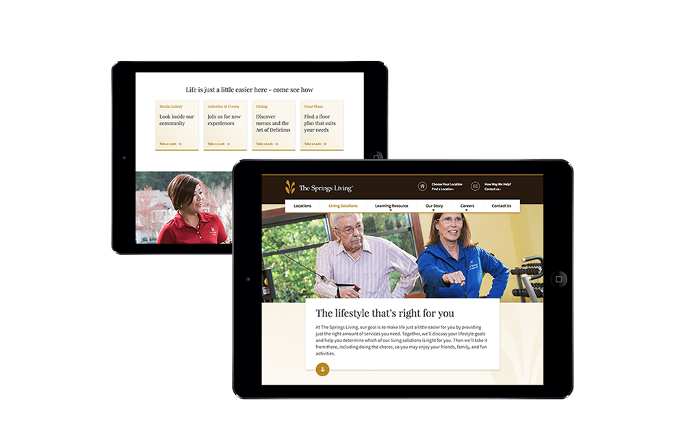
The new site was a major UI upgrade with all-new styling and frontend templates. Craft CMS was the ideal choice for this project, because it had the flexibility we needed to develop the site, and will stay robust well into the future. Best of all, Craft gives The Springs Living team an easy way to manage, update, or add content across various categories and locations—great for keeping similar or identical content across 17 communities error-free.
Same Brand, New Story
The new site provided us with an opportunity to tell The Springs Living story in a more authentic way. The Springs Living is a true forward-thinker in its space: residents aren’t simply taken care of, but live full, exciting social lives in their communities. By elevating the company’s core values and the stories behind them, our redesign shifted the brand message to one of innovation and quality, rather than competing on care options and locations.
Bringing the Unique Features of Each Location Online
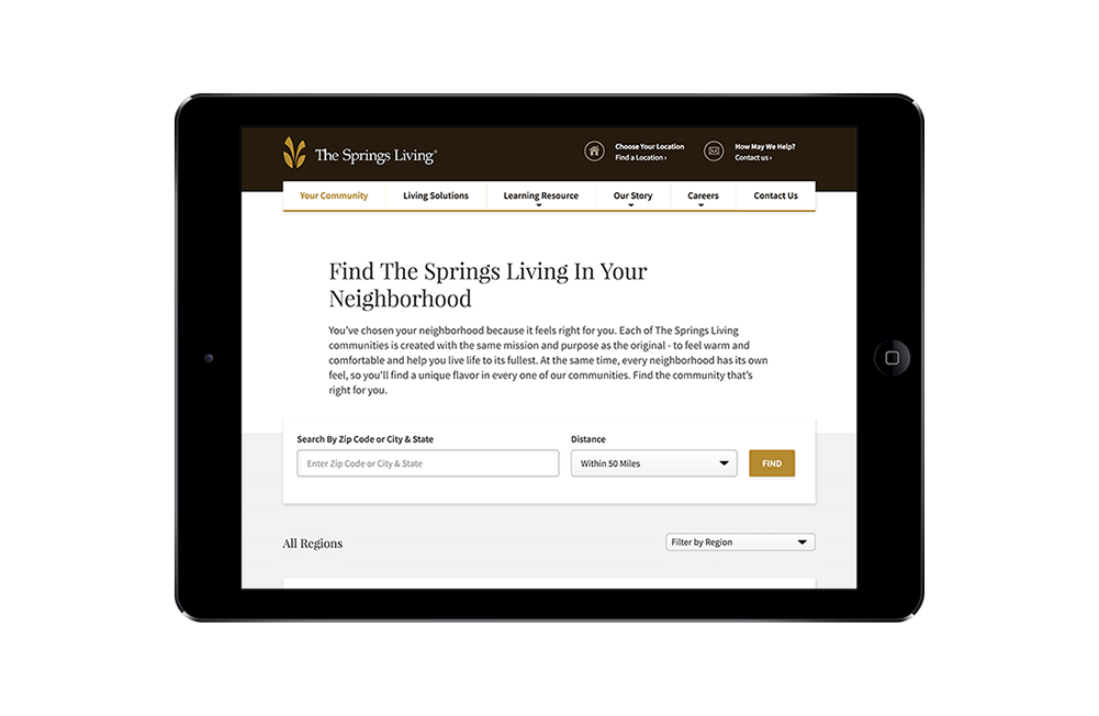
We mapped out user journeys to replicate the experience of visiting a Springs Living community. Using a new location finder tool, visitors can explore communities in their neighborhoods or search by region. A “Live With Us” tab on each community page highlights dining menus, activity calendars, location staff, and photo galleries. The sales funnel now starts by promoting lifestyle and finishes strong by giving visitors information about care solutions and driving them to contact customer support, either by booking a tour or requesting more information.
Thoughtful Design Informed by Data and Customer Support
These are only the highlights. The Springs Living website redesign was a massive project that incorporated a number of elements, including…
- Better organization of learning resources into FAQs, Videos, Testimonials, and Press
- Custom icons and graphics
- Styling and preparation of images throughout the site
- An improved lead generation endpoint with attractively styled new forms, additional data collection options—such as the option to download forms—and clear calls to action driving leads to the forms
- Accessibility and readability optimization
Many of these improvements, including the new Careers page, would only be window dressing without underlying digital marketing insights. Given The Springs Livings team’s experience with previous vendors managing their data in an opaque fashion, we made a point of communicating the reasoning behind our design decisions.
Results
Daylight helped The Springs Living launch an eye-catching new website with a total of more than 200 pages. The redesigned site is built on a custom CMS that provides The Springs Living team with a single location to manage all their communities from one login and administrative menu. We also improved the company’s search engine rankings while wrapping up the project and managing SEM post-relaunch.
The first 6 months of the new website saw a 15% increase in total traffic year-over-year, and the eye-catching new design led to better engaged users as well:
- 22% increase in new users YOY
- 31% increase in the average visit length YOY
- 26% more pages viewed per visit on average YOY
- And a 19% decrease in the overall bounce rate YOY (a basic metric on a site’s “stickiness”)
Successful Launch
Beyond basic traffic and engagement, the new website has performed better in capture leads through its primary calls-to-action too. The main contact form for the company saw a 281% increase in submissions year-over-year, while form submissions from the primary lead-capturing CTAs increased 81% YOY. Most important, just as The Springs Living isn’t an ordinary senior housing provider, the new site bucks the industry formula of promoting businesses locations and care options. Instead, the site is structured around the unique aspects of the brand and the needs of its target audience. Because, at The Springs Living, life should be a little easier.
Industries
Travel & Hospitality
Services we provided
CX Strategy & Lifecycle Mapping
Product & Solutions Ideation
Solution Architecture
UX Design
Prototyping
User Testing
